Genesis
Near the end of 2008, way back in the dark ages before tablets, Asus released one of the first netbooks: the eeePC 901. I had always been entralled by the idea of a "carputer", and in particular an omnipresent map of my surroundings. It seemed at least some part of my crazy dream could finally see the light of day.
The timing was opportune; the concept of easily-repurposed digital maps was only four years old, with the release of Google Maps and their innovation of the tiled "slippy map". Satellite imagery was also a key element of my vision, and it was nearly impossible to get your hands on before Google Maps added satellite view a year later. It was a revolutionary time.
With my new USB puck GPS still shipping from Amazon, I set out to survey the state of Linux navigation apps. I quickly realized I had my work cut out for me. Hideous interfaces that didn't cooperate with full screen; garish icons; position that only updated in discrete jumps; maps that didn't scroll smoothly. And, perhaps most controversially, only pulling from free-and-open map sources that at the time were sparse and looked, frankly, terrible.
I knew I would have to roll my own, and my sole design criterion boiled down to:
“does not look like complete ass”I got to work and thereafter birdseye was born.
Overview
The birdseye "suite" is actually several components.
Caching
Before you can do anything, you need to get maps onto the netbook. For this you use the caching tool.
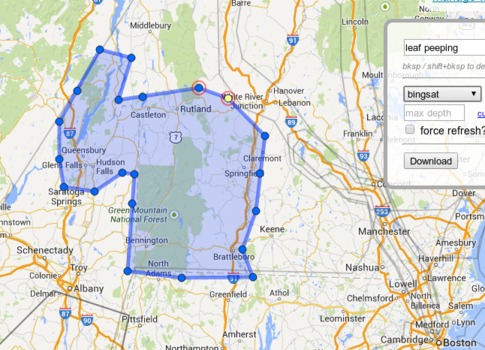
While you are still online, you open the caching tool and outline a region of interest. Specify the max zoom level, then the caching tool will retrieve all necessary tiles for your desired map layers and save them to local storage. The downloader is multi-threaded and uses optimized HTTP, so can actually work blazing fast; typically the bottleneck is in writing to the eee's sub-par SSD.
The caching tool de-duplicates tile storage, thus avoiding millions of identical 'ocean' tiles, in a manner very similar to Mapbox's mbtiles format. It also omits overlapping regions that have already been cached. One interesting consequence of that is the app sometimes has a very 'retro' feel. Google's map style has changed markedly over the years and you don't realize quite how much until you stray into the time capsule of an area that you cached many years ago.
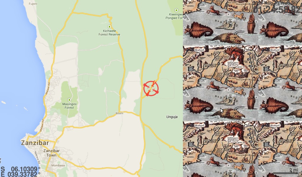
Available map layers are defined in the app configuration, and basically any map tile service with a public URL is fair game. If you can view it in a browser, you can cache it. My personal configuration has specs for map, satellite, and terrain view; topographic maps; and even nautical and aeronautical charts.
Bulk caching in this manner may very likely violate the map provider's ToS. As long as I do it only for personal use, and choose my coverage area judiciously, it's hard to feel too guilty. However in distributing this software, I've only included the URL specs for providers whose license explicitly condones it. If you want to enter the grey area, you must reverse engineer the URLs yourself.
My caching methodology is to save a series of progressively localized and detailed basemaps, followed by detailed caching of specific routes/cities on an as-needed basis. For example, my 'default' basemaps are:
- whole world to zoom level 8
- contiguous US to z11
- my broader "region" (roughly a Maine-Chicago-Atlanta triangle) to z13
- southern New England and New York City to z16
Then I would follow a similar basemap + inlay pattern for places I plan to visit. The broader region to z11, specific cities to z16, and anticipated routes to z13/14.
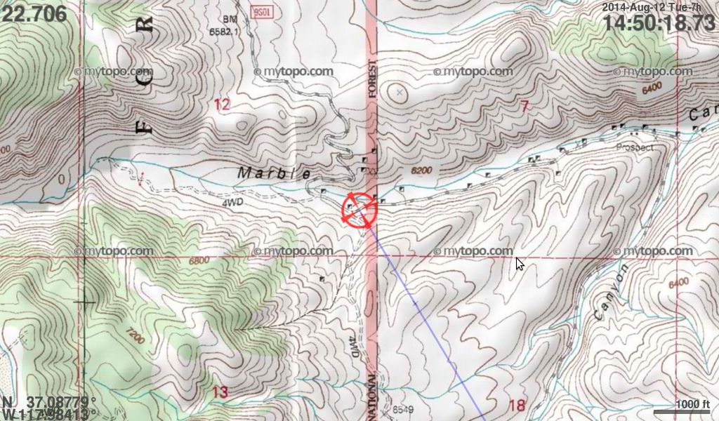
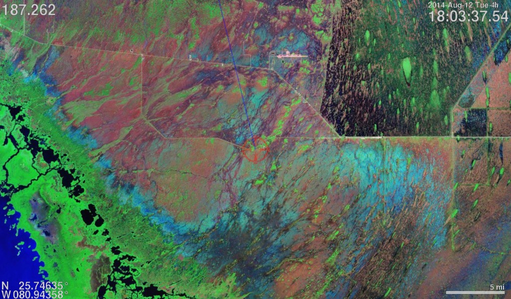
Cache your maps well, or else…
Navigation
The actual navigation UI is comparatively simple.
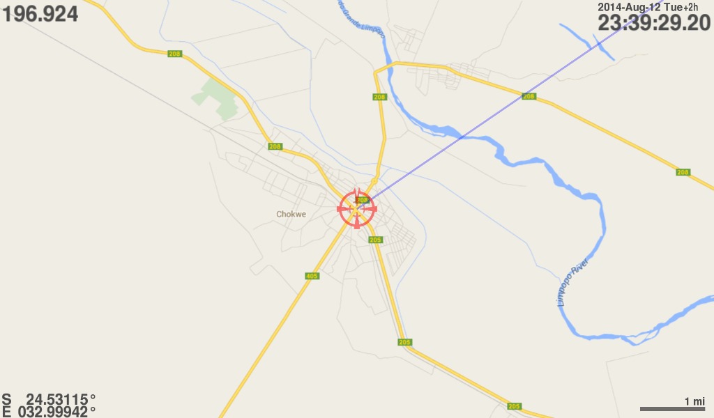
You get a moving map always centered on your current position. You also get a single 'destination' waypoint with straight-line distance and bearing. That's... pretty much it.
Part of the simplicity simply stems from the logistics of an app meant to be used while driving; you don't want to be doing much. Navigation mode actually only supports four controls:
- z
- zoom in
- x
- zoom out
- v
- change map layer
- m
- mark current position
All rendering is done with OpenGL for optimum crispness and smoothness.
Backend
A few backend services keep everything running.
First, there is a GPS broadcaster service (which wraps gpsd). This service cleans up the idiosyncracies of the GPS itself and interpolates between position fixes (typically one second apart) to provide a smooth location track.
In tandem with the broadcaster, there is a logging service that keeps a persistent tracklog wherever the app is used.
Lastly, there is a "conductor" of sorts that keeps all the different components running smoothly. It monitors all components (and the hardware device itself), gives alerts, and restarts things if they crash. You certainly can't drop down to command line to debug things on the road.
Why not get a TomTom?
Aside from the obvious DIY appeal, several reasons…
Foremost, I did not want to be beholden to a proprietary company's whims of what maps are fit to run on my device. We're at the dawn of an age of ubiquitous mapping, and I wanted it — all of it — at my fingertips no matter where in the world I was or who it was published by.
Another reason is that a stock car GPS would give me more help than I want. I like doing the navigating and determining the optimal route. My personal opinion is that turn-by-turn directions make you soft. I want to be at the helm of the command center, so to speak. The map just another (very high density) information stream.
Final reason: UI bling. Keeping with the 'command center' analogy, I want my app to look like some elite hacker app that the Lone Gunmen would use. Spinning dials are good. Distance to the thousandth of a mile. Clock time to the hundred of a second. Indulge my inner (outer) geek and display speed in meters per second or as a portion of the speed of light…
…and why limit yourself to just the car?
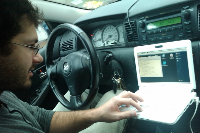
Action Shots!
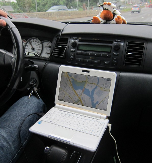
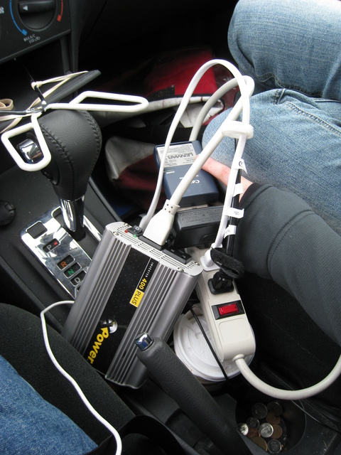
The "platform" of tongs wedged into a center console compartment; laptop secured with a rubber band. Surprisingly sturdy. Power on longer trips supplied via shown inverter. Many have questioned the presence of tongs in my glovebox.
Alas
Sadly, I never got as far with this as I would have liked to. I had many more grand ideas for features, including:
- alternate orientations, like "track up" vs. default "north up", or multiple panes showing different zoom levels simultaneously
- administrative areas, to indicate your current country/state/county/township/national park/exclusive economic zone/whatever
- an event-based rendering pipeline to prevent 'jitter' and other blocking of the UI thread
- display your path travelled / breadcrumb trail
- upload your expected route via kml; display distance along route / distance off-course
- ETA calculation based on average speed
- position of sun; time of sunrise/sunset (considering it changes as you move)
- automatic timezone switching
But with the smartphone revolution, and compelling features like real-time traffic, I started devoting less and less time to birdseye. You can only invest so much effort for a userbase of 1.